Marvel Studios
WandaVision
Main Title Sequence & Episode Titles
Marvel Studios’ first step into a streaming series was super exciting and much anticipated. When we first spoke with Director Matt Shakman and his team about the psychological framework and the nostalgic television through lines our whole team was salivating at the fertile creative opportunities. We got to work right away and spent more than a year helping to build Wanda’s world!
Year
2019-2020
Client
Marvel Studios
Emmy nominated for Outstanding Main Title Design - 2021
Main On End Title Sequence

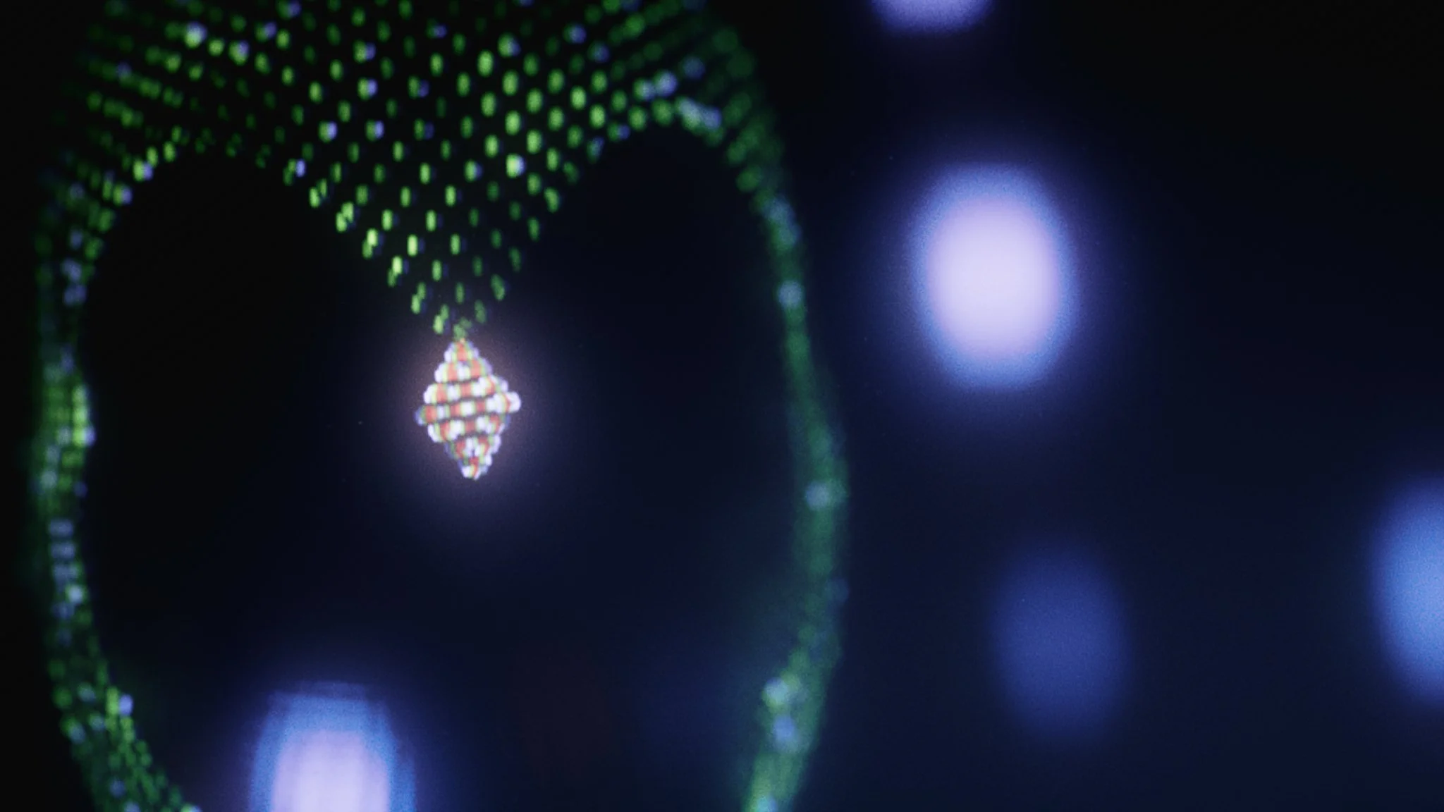
Our collaboration began by pitching several concepts for the Main on End Title Sequence for WandaVision, all of them playing on the themes of Wanda creating this idyllic world for herself and her family. Working with Matt Shakman and the Marvel Studios team, we eventually selected a world made of pixels (what we termed “hexels”) that would represent the hex that Wanda had over this town and it’s people.
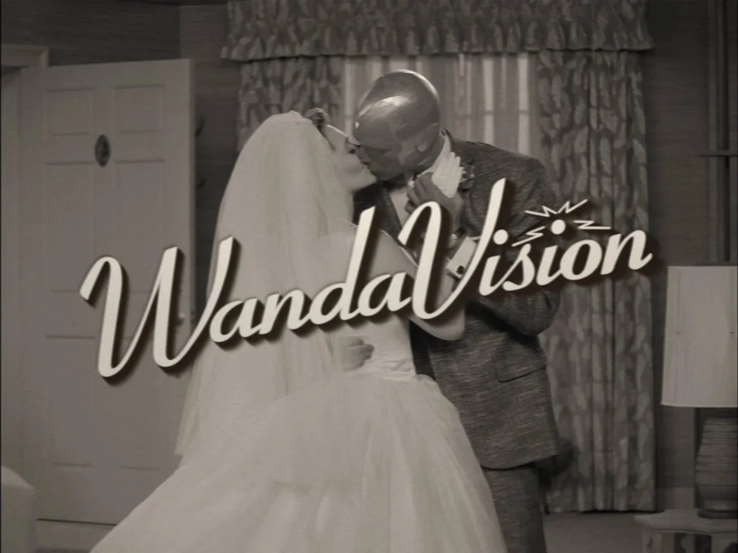
The sequence begins with a Please Stand By message, a symbol from classic television that something has gone wrong. As we see the picture return, the viewers are pulled through the screen and into this world of colorful, shimmering pixels. We built imagery from the show in these dimensional pixels before tearing them apart as Wanda’s world begins to come crashing down.
Overall this was a unique idea executed artistically and beautifully by our creative team. The sequence was nominated for an Emmy Award in 2021 for Outstanding Title Design.

Episode Title Design
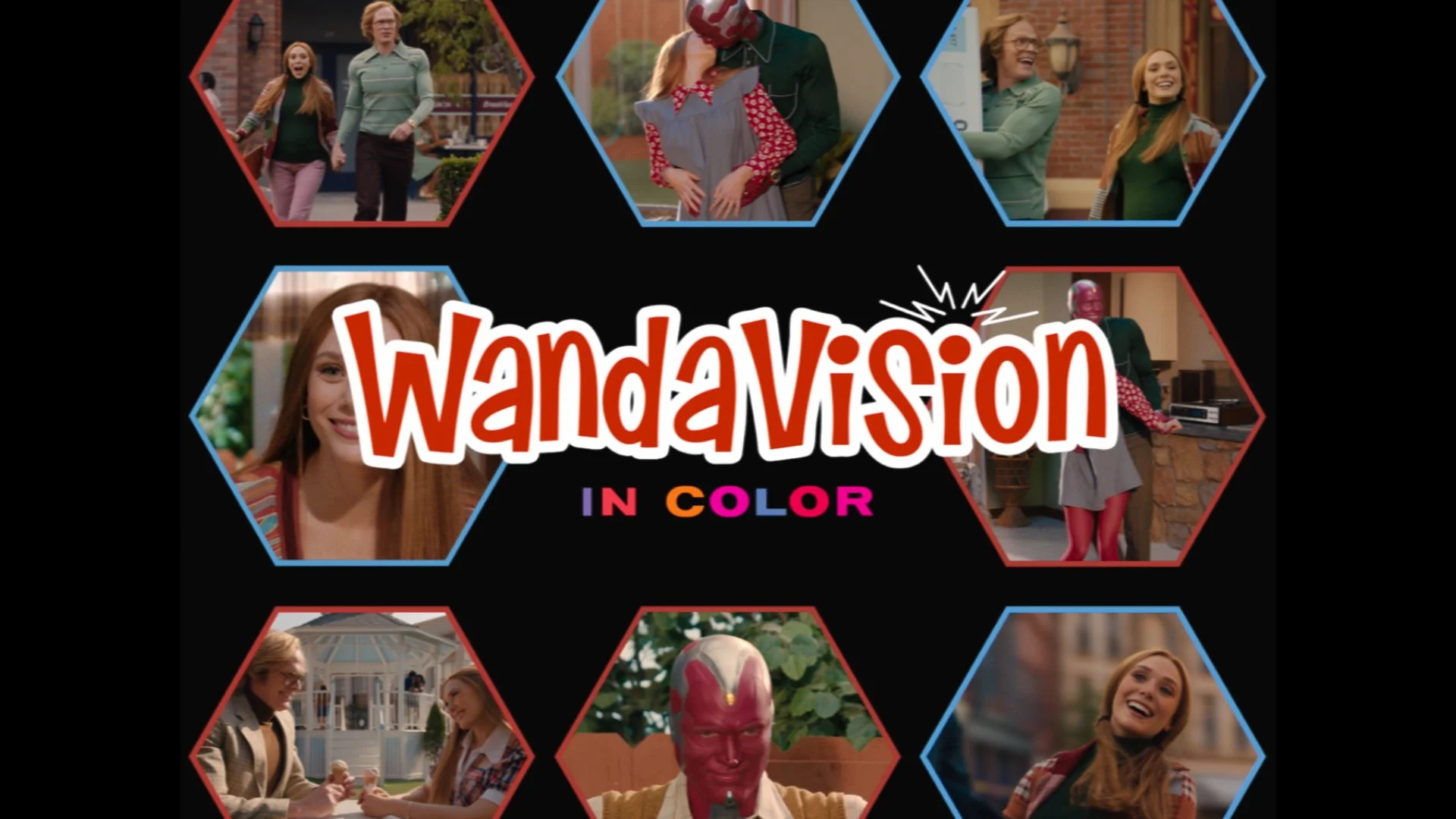


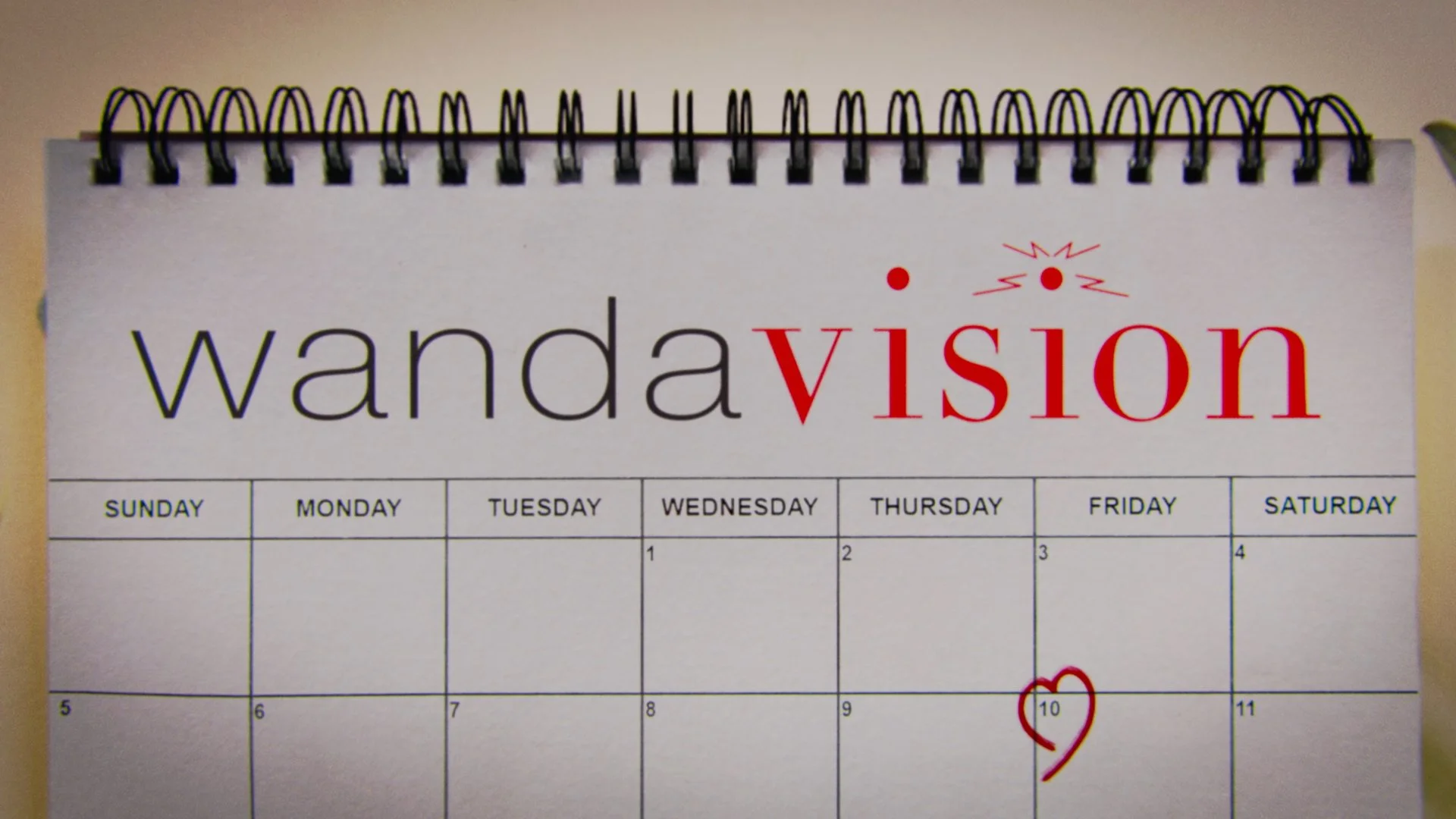

Continuing the fun on this series, the Marvel Studios team had a plan that every episode will be themed for a classic era in television. They took great care to maintain authenticity and our job was to be as faithful in our title designs. This was a particularly enjoyable part of this project because I am a child of 1980s, 90s, and 2000s television so I jumped right in with my team in pulling references and figuring out what details make each era feel unique.
In the end we created a series of lovingly crafted sequences to help support Matt Shakman’s “love letter to television” through the style of these episodes. In the thumbnails above you can see:
1960s - In the style of The Dick Van Dyke Show
1970s - In the style of The Brady Bunch and The Partridge Family
1980s - In the style of Family Ties
1990s - In the style of Malcolm in the Middle
2000s - In the style of Happy Endings
As a producer, this project was a finely choreographed effort over a year with my counterparts at Marvel Studios, Mary Livanos and Amanda Weir. We had to coordinate shared assets between the episodes, varying delivery formats because of the themed episodes, and an ever-shifting delivery and finishing schedule. Internally, finding the right talent was my mission in order to make sure that each stage of our production had the right team with the right skills. We had 3D, 2D, graphic design, and animation teams all working at various stages to put this series together.
I am super proud of all that we created for WandaVision and the creative force that our team brought!
Studio: Perception
Chief Creative: John LePore
Art Director: Doug Appleton
Head of Operations: Kris Barone
Producer: Eric Daly
Associate Producer: Peyton Goldfarb
Artists: John Koltai, Vlad Lysenco, Bhakti Patel, Alex Rupert, Chris Szeto, David Wave, Dave Weinstock, Nick Woythaler, Ryan Uhrich
WandaVision Design Montage
"Massive congratulations to you and everyone at Perception for your Emmy nomination!"
— Carly Plasha, Assistant to Matt Shakman